Travelday User Page
Overwiev
Travelday company is an online travel guide that helps people with finding inspirations and unique destinations and also booking flights and accommodation. As the company collaborates with many travel providers that offers transport, overnight stays or activities for travelers, it creates a fair competition in the market for smaller agencies.
Problem
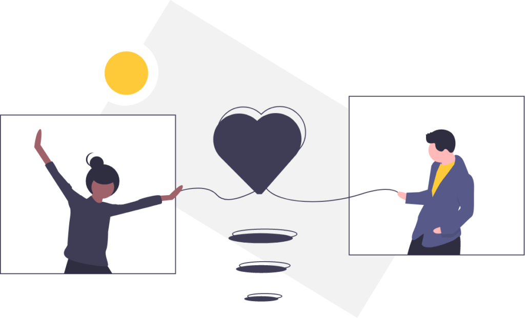
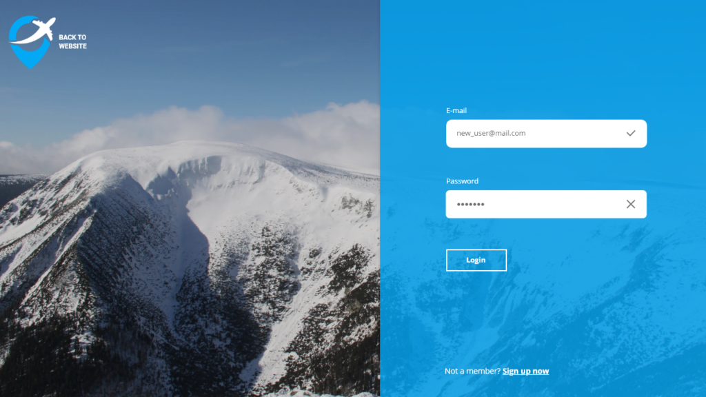
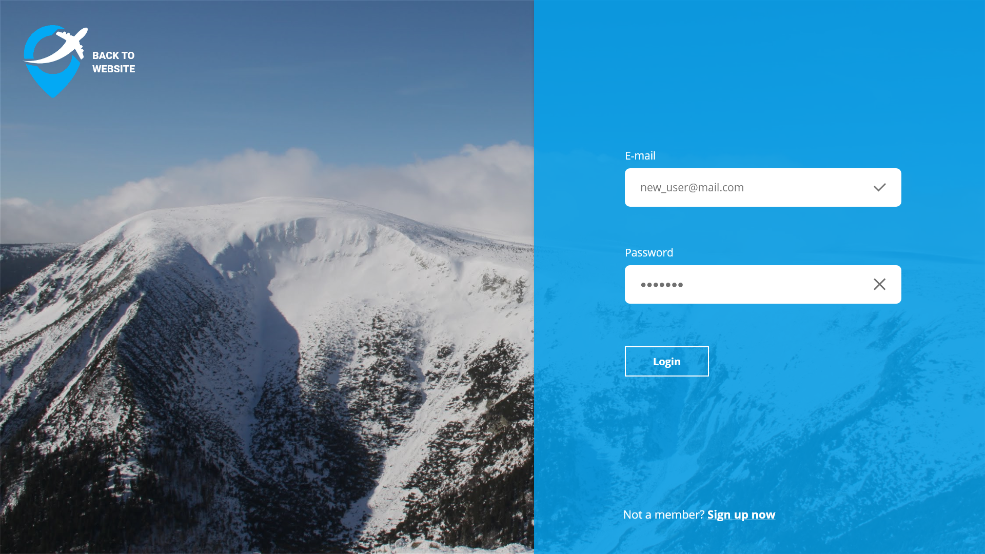
The main issue of Travelday is the lack of community, that people don’t have a reason to come back and they don’t have the possibility to interact to each other. The lack of user page on the website makes it impossible for Travelday to create a community.
Problem statement
After talking with our Client, we knew that our users weren’t held on the website due to lack of personal connection to it. They haven’t felt that they need to come back to the website that doesn’t create personal values for them. There is no option of creating the profile, nor saving your searches or adding to favorites anything that you found interesting. That’s how the first question appeared in our minds :
- What’s unique about Travelday and their solution, how are they different from their competitors?
- How can we increase the traffic for Travelday’s solution/website/socia media and make users stay there and even come back later?
- How can we best create awareness and interest among the target groups of Generation Z and Millennials – and what are they interested in?
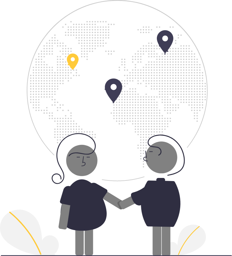
Target group
To create good, valuable content and design for our digital solution, first we had to understand for who we needed to do this. We spent a considering amount of time trying to figure our target group, and afterwards to understand their goals, lifestyle, values and interests, so we can create for Travelday a relevant digital solution that fulfill the needs the target market and stands out to their competitors.
We asked our client about the main target group of the website, and he replied “Millennials” and “Generation Z”, because these are the people who enjoys traveling and trying new experiences the most.
Millennials are the generation, born from 1980-1995. Within a few years, Millennials are the largest labor force in Denmark and, in addition, are excited about new experiences. They want to go out and get new unique experiences, but do not have time to explore it as they are busy with their career, family and self-indulgence.
Generation Z is people born between 1995-2010 and are true digital natives. They are getting their knowledge from the internet, focusing on founding fast information.
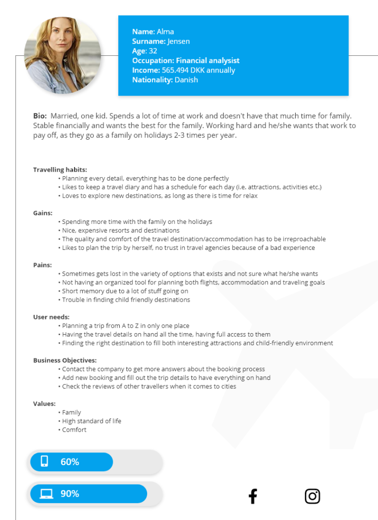
Personas
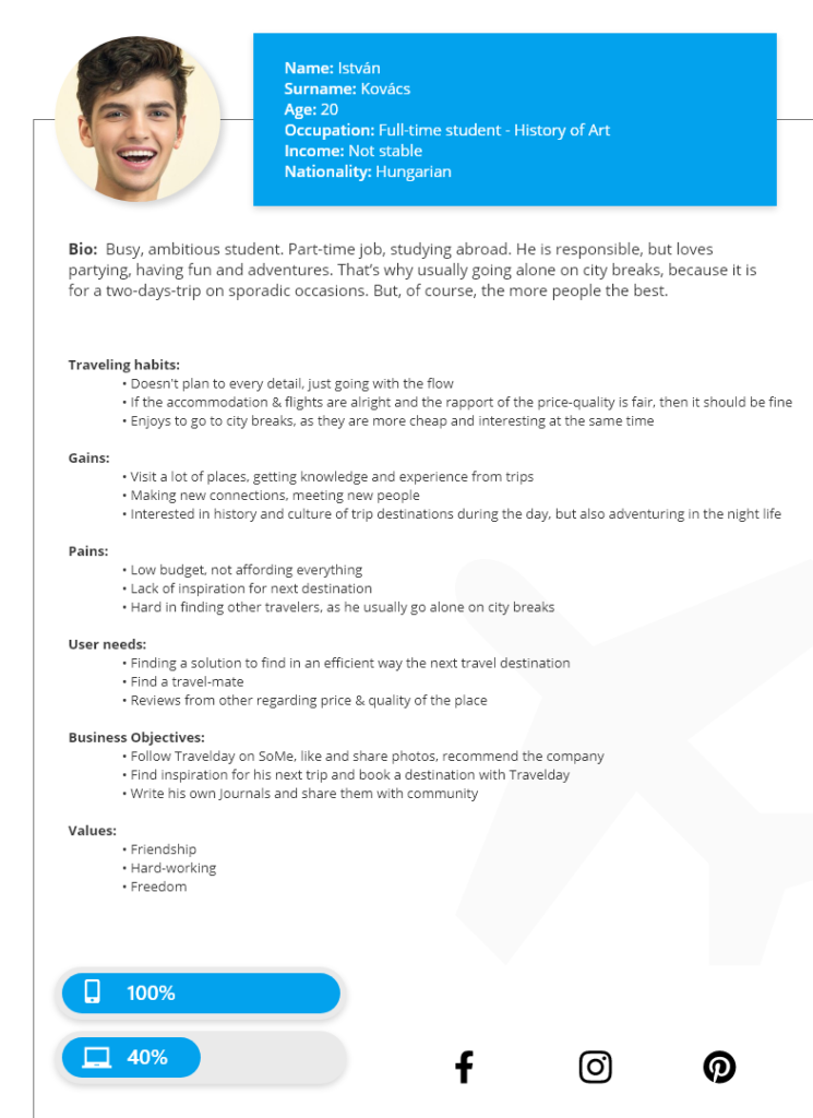
In order to have a clearer idea about the users we were creating the solution for, we came up with two personas: a representative of millennials and one of generation Z with specific problems, needs and desires. Of course we didn’t forget about the business objectives of the company in relation to each persona. Therefore, meet Alma and Istvan.
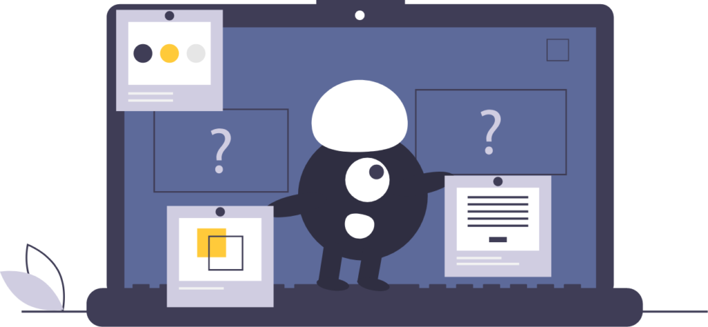
Mindmap
After we understood both our client & it’s user needs, we started to brainstorm of possible content, ideas and so on. Our goal was to make a user page that would make the users to come back to this website and so it would help Travelday to expand their business. Therefore, we created a mindmap with all the relevant ideas we got so far so we can visualise them better:

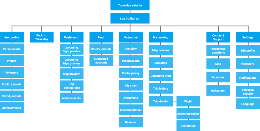
Concept & Sitemap
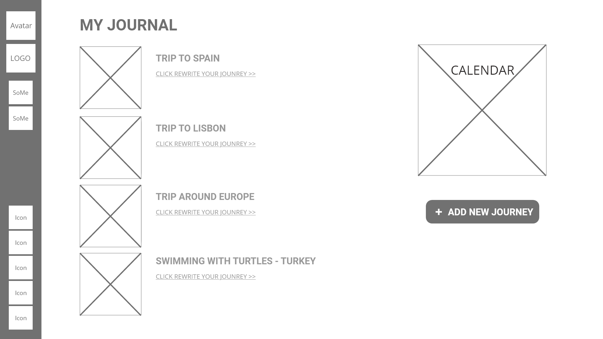
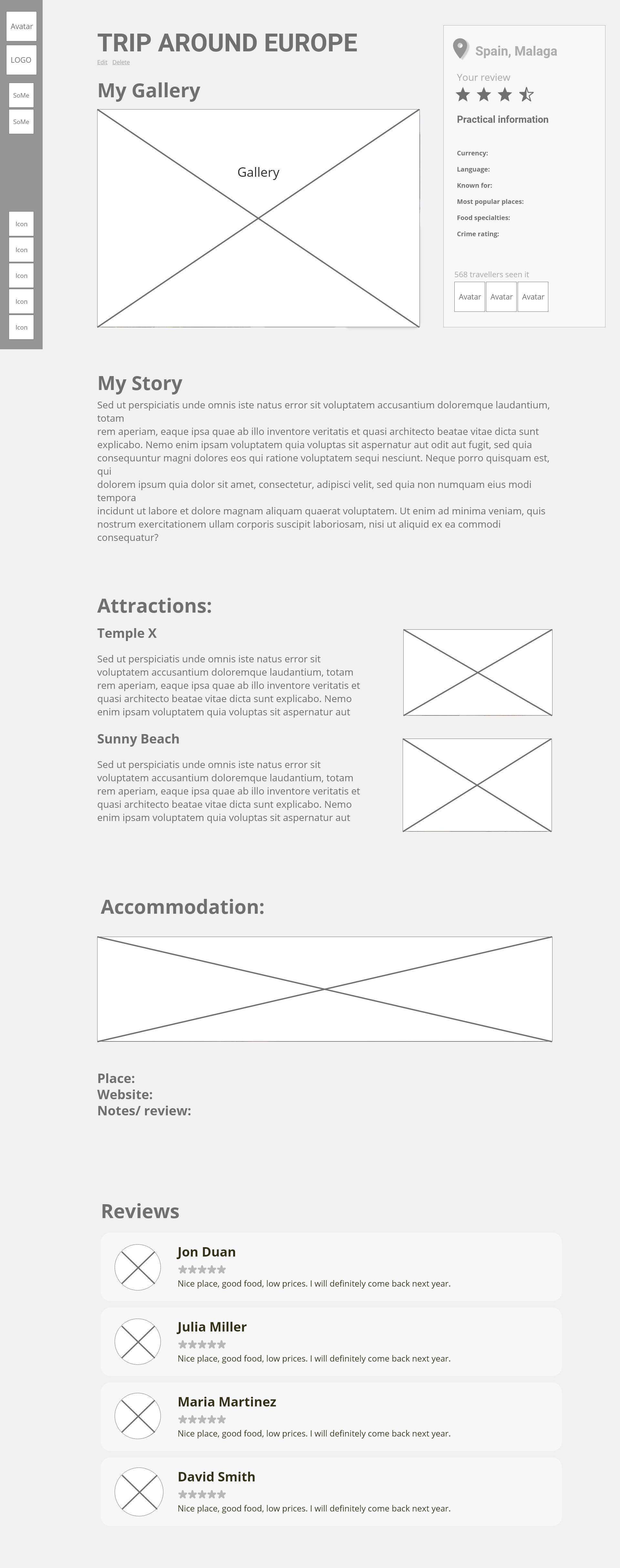
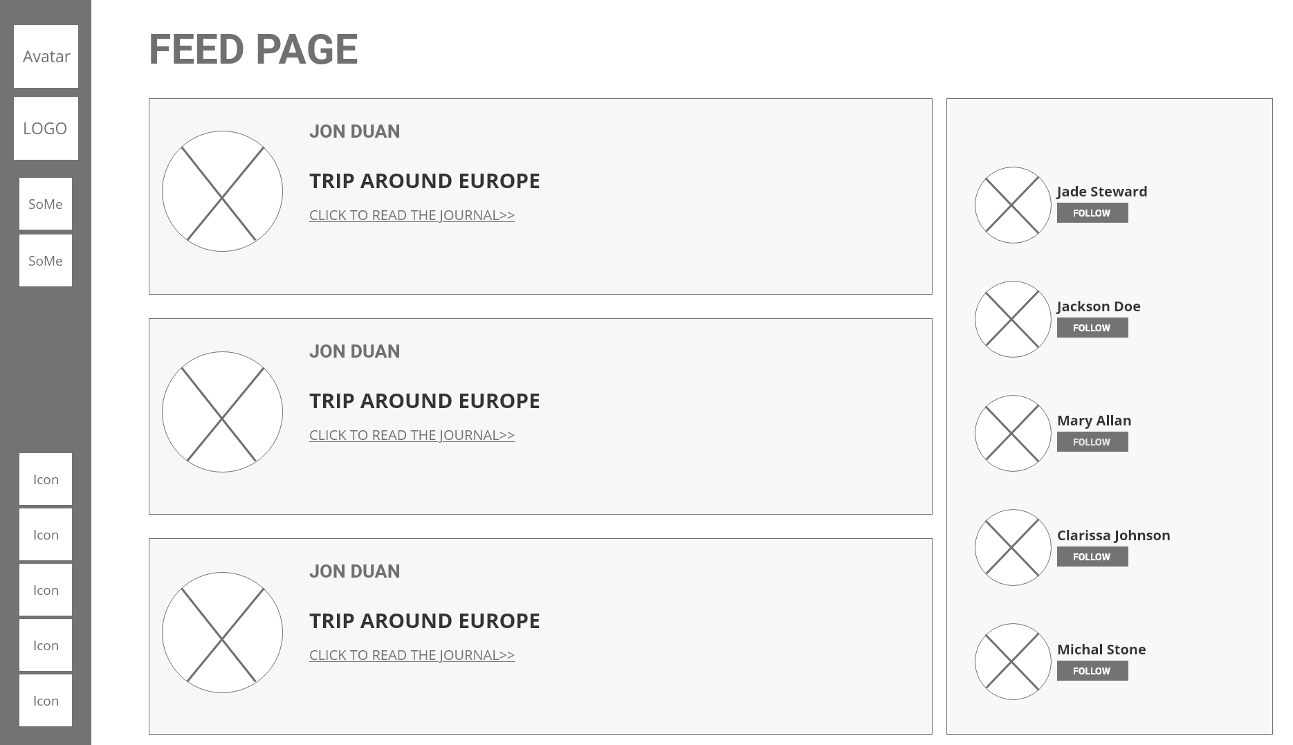
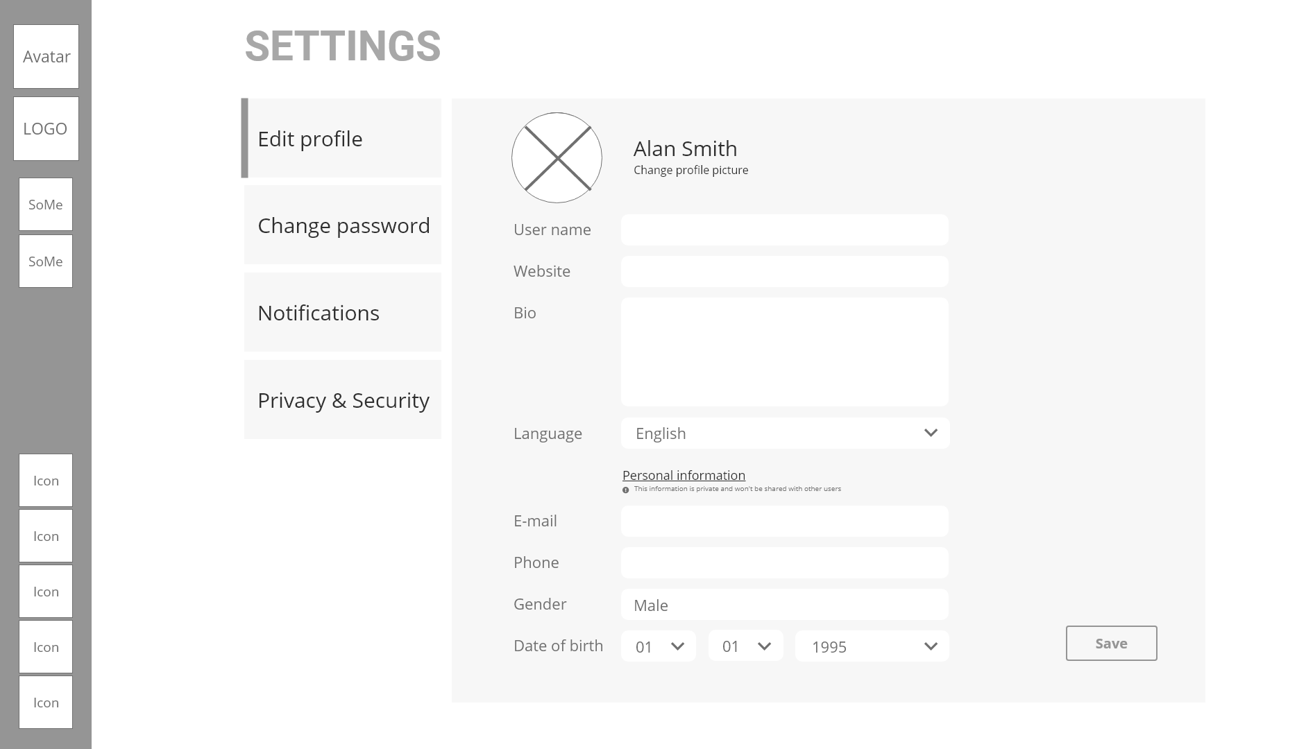
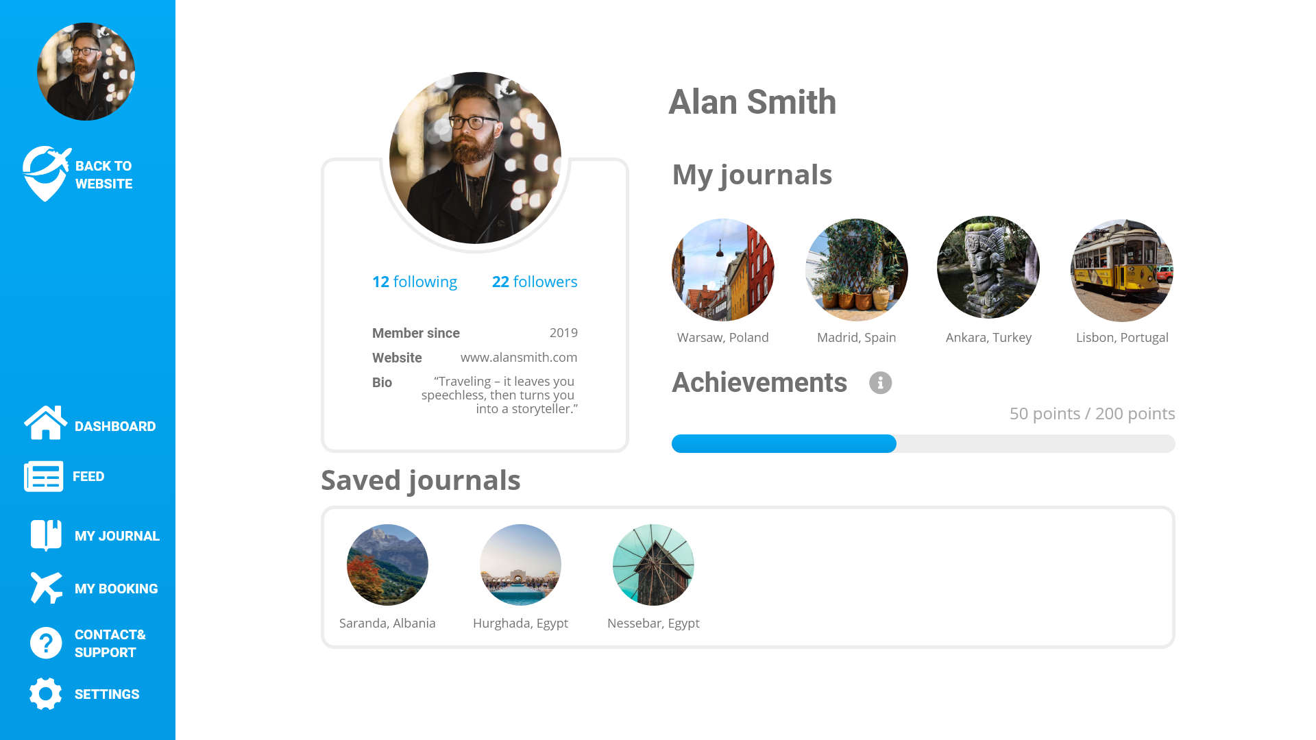
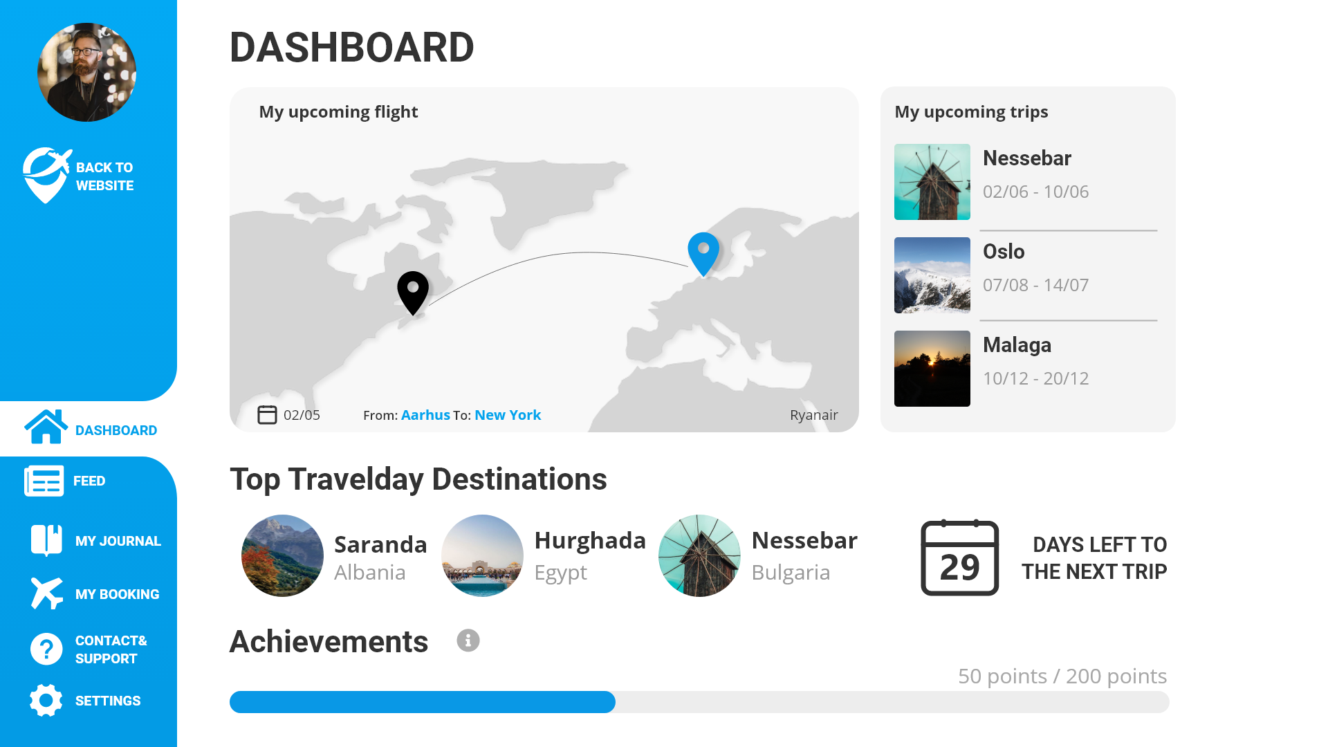
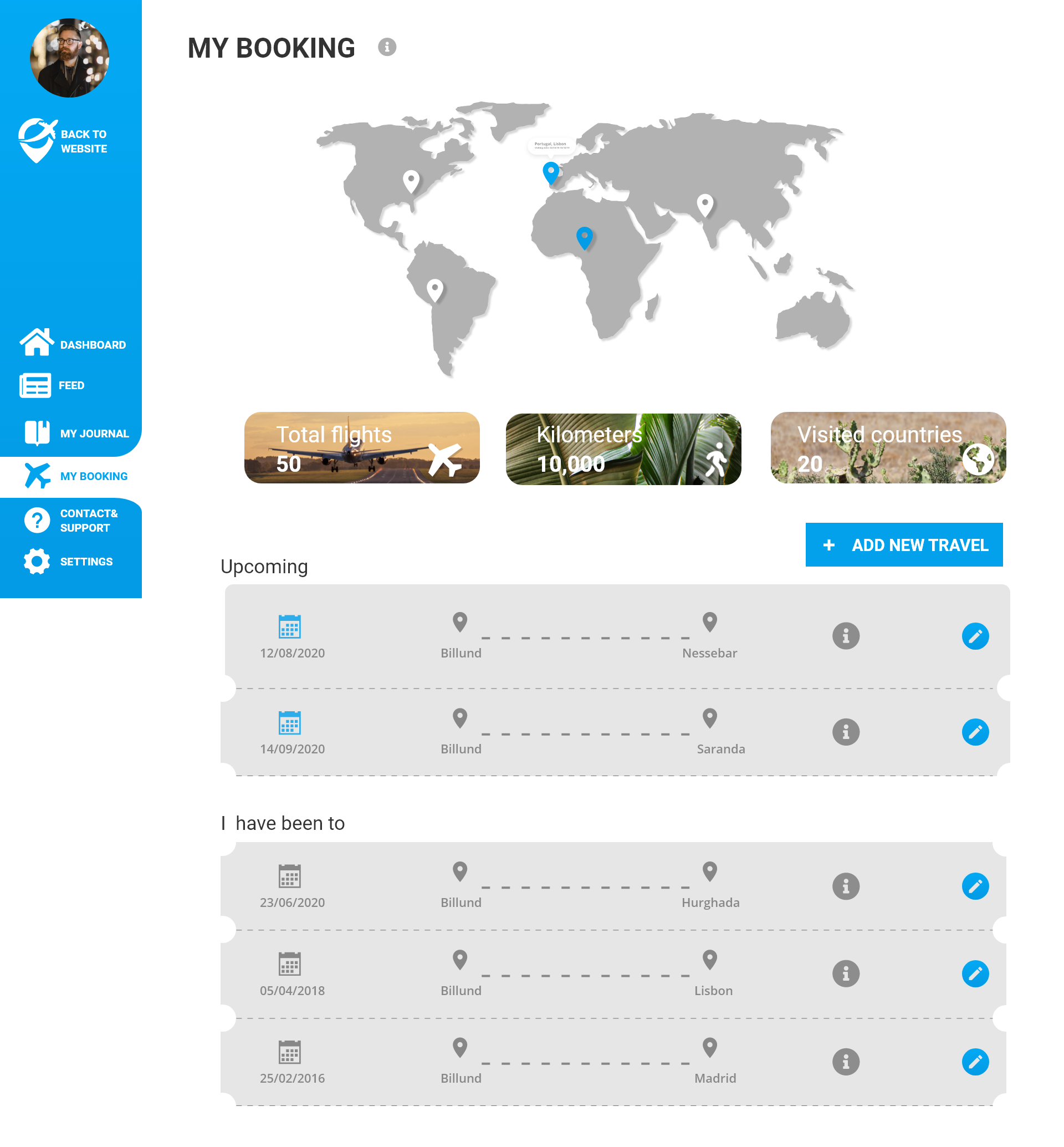
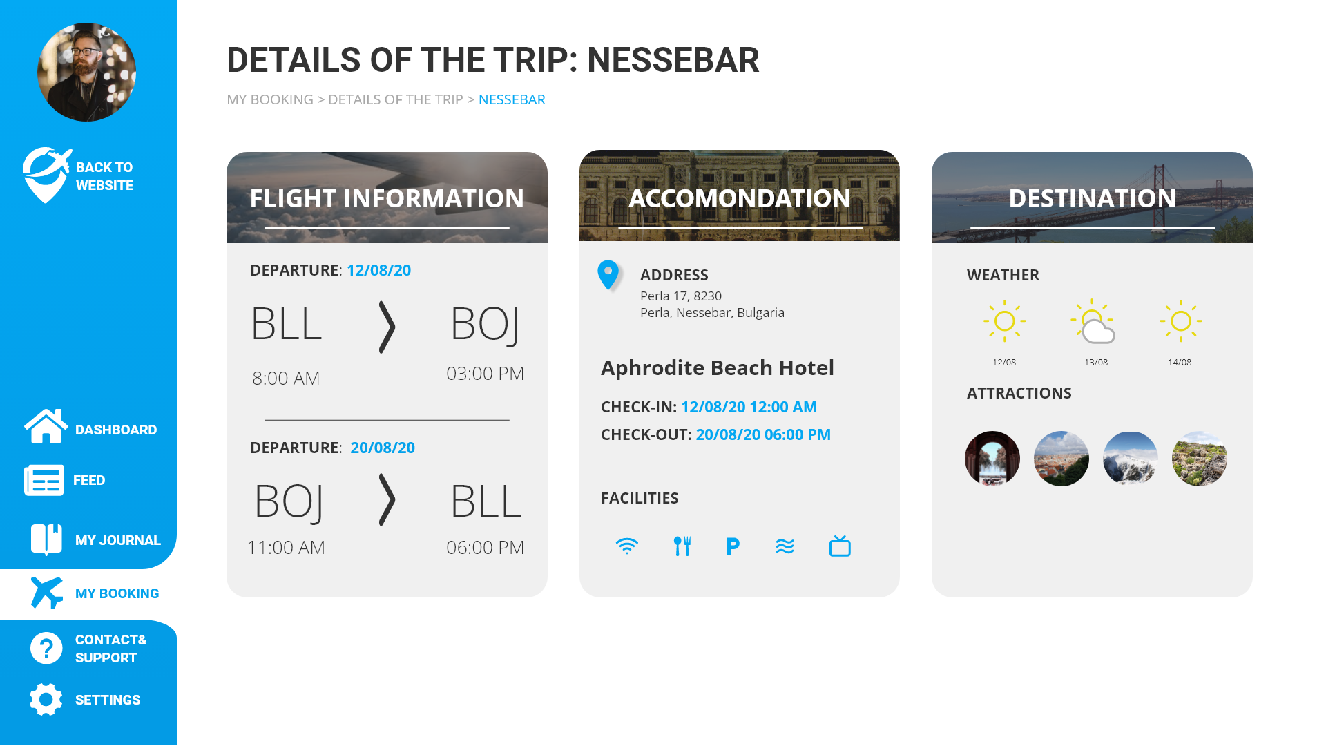
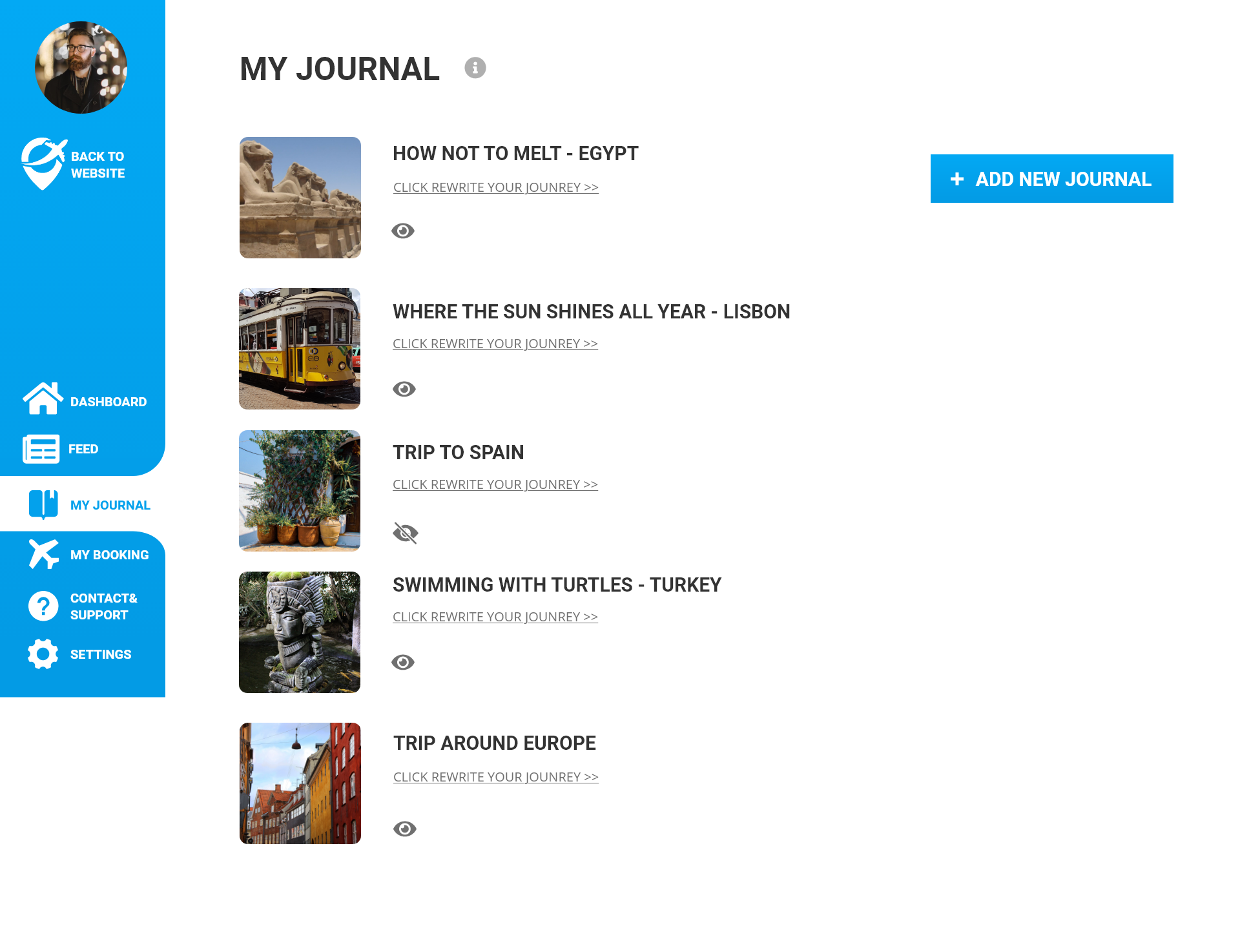
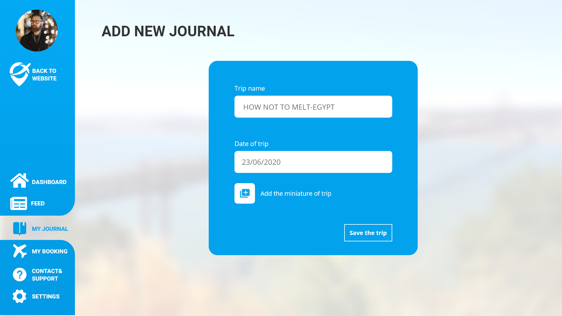
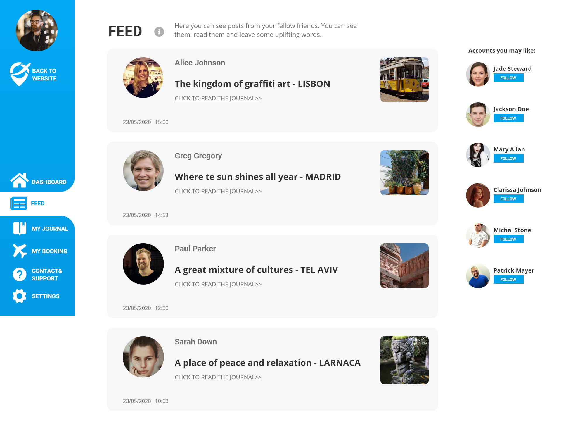
After a lot of discussions and long hours we have been decided on a final structure of our user page. There are two main functions Travelday user page: to save their trips & destinations (including flights, accommodation etc.) and to post and review their experience in a certain destination.
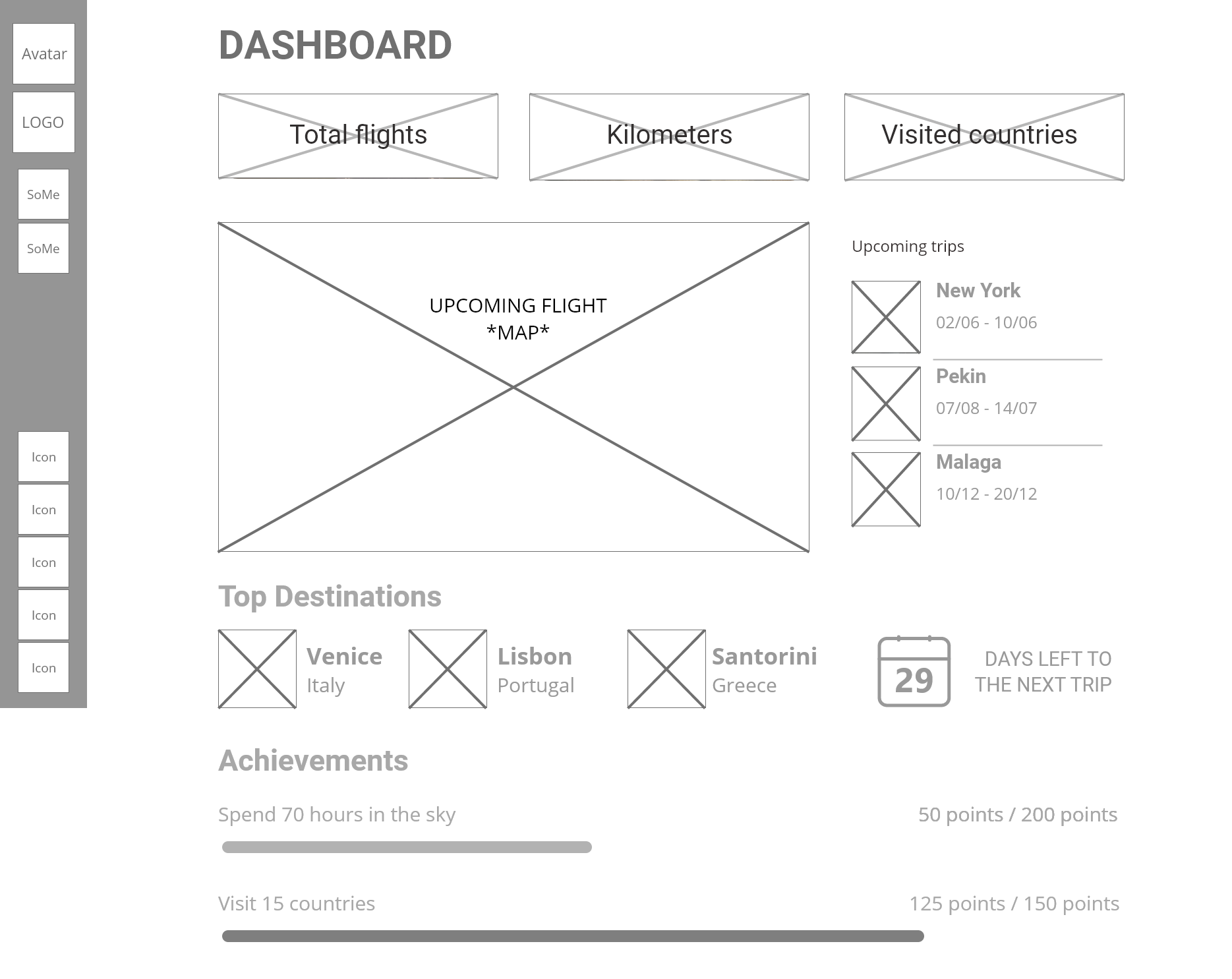
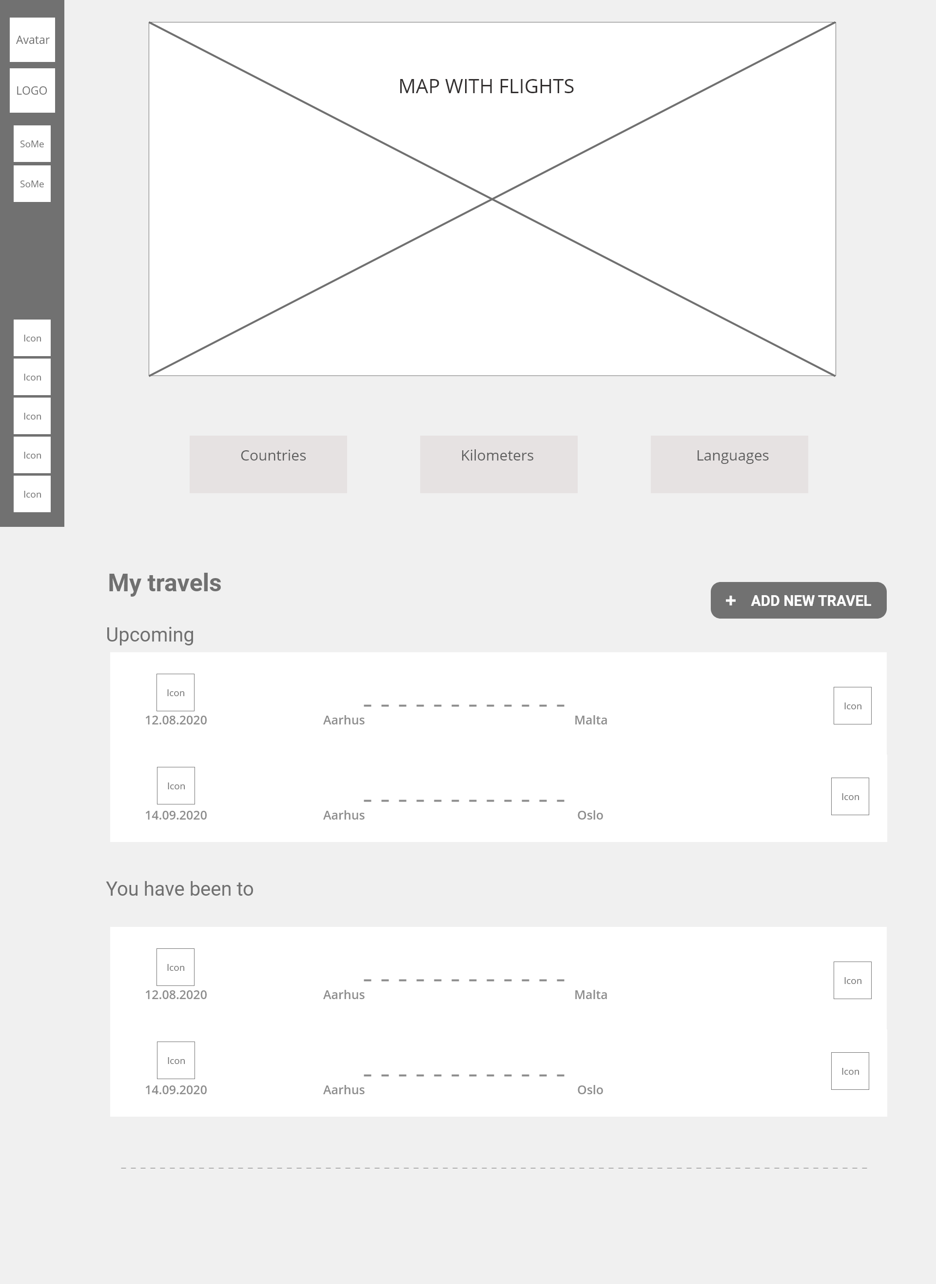
Mockups
As an opposite of wireframes, mockups represent a high-fidelity prototype, which means this is the final design of our digital product. We did them in very detail and very carefully, because the design had to be consistent and relevant for the client we represented, for the audience we focus on millennials and generation Z, but especially for our personas. Therefore, my team and I spent a lot of time doing and elaborating on them, and we did a lot of usability tests until we reached the final version.
Usability testing
Usability testing is one very important step when designing a prototype, as it is showing us, as designers, if our users can actually understand and use our digital solution as we want them to. We did many usability testing before we agreed on the final content and interface of our product, because we wanted to make sure that everything was logical and understandable for the users.
We did three testing in total: two usability testing with tasks and an A/B testing method. For the usability testing, we sent our fellow students our AdobeXD working prototype and a list of tasks to achieve, and we asked them to record their screen while doing it in order to see if they manage to complete them and to hear their comments about our prototype.
Outcome
It was a tough time as we set the bar high. Our client dealt with lack of user page on the website – a place that could help the users feel affiliation to the company. The website was also missing the community that the client has been trying to achieve since foundation of the company. Being aware of the problem and trying to understand the target group behavior we could create a user page – a part of the client’s website that can help the company gather more users. Thanks to that more and more customers will stay with the company for longer.
We wanted to give the customers something more – a partnership that keeps the travelers together. We wanted to offer a place where they can collect their memories, share their stories and plan next dreamy journeys. What is more, our goal was also to create an awareness and interest among the target audience to increase the traffic and make the company more recognizable on the travel market.